Showing posts with label templates. Show all posts

Tuesday, 19 May 2015

Best Blogger Templates for Fashion, Tech or Author Blog | ThemeXpose


best blogger templates for fashion and tech blogs


A Blogger template has the same importance for a blogger as bones structure is important in a Human Body. A template can make your blog look professional and can turn the tables for your blogging career as well. Best blogger templates are perfect fir for a Techy Geek's blog, Fashion lover or a Story writer's blog.

How to Chose One of the Best Blogging Template?

There exist a permanent problem with newcomers to blogging that they feel all the styles of their blog unsatisfactory and tend to change them again and again at random intervals. So picking one is really hard for them. Now, you should pick on template and start weaving your blog on it. Don't think of the appearance until you've hundred of posts and tens of static pages in it. Make sure to have at least one image in every post so that any template should look quiet nice for your blog. 

Best Blogging Templates for Blogger

The collection below is taken from themexpose which has a big list of sylish, beautiful and elegant blogger templates. Each of them is perfect of its kind and best from the identical.

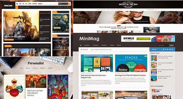
1. MiniMag (Hueman Copy)

minimag Hueman template for blogger

2. Feminist Clean & Responsive Template

feminist template

3. Viewer Responsive 

viewer minimal magazine template

4. Outfit for Fashion Blog

outfit template for fashion bloggers

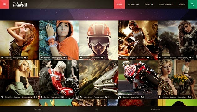
5. Fabulous for Gaming or Tech Blog

fabulous template for games blog

6. YourMag Tech Magazine Blogger template

yourmag tech magazine

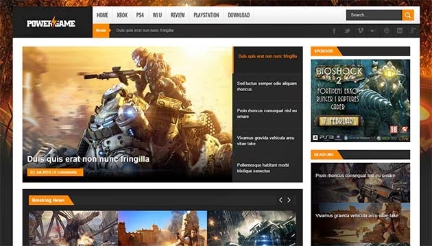
7. PowerGame Gaming Template for GameLovers

powergame magazine

8. Peronalist Author Blogger template

personalist gridded template

9. Gaps Magazine Style Responsive Blogger Template

Gaps template green blog

10. LineZap Responsive Magazine Tech Blog

Linezap Responsive Magazine Theme for Blogger

Monday, 11 May 2015

SIx 3 Columns Blogger Templates Free Download


top 6 three column blogger templates

For a perfect engaging blog, most of the bloggers love to have a three column blogger template on their blog. 3 column blogger templates are seen with very positive point of view by the audience and are able to give your blog a feel of vast blog. Three column templates are found in many layouts. like both side sidebars, two left sidebars and two right sidebars. Many of them have both side sidebar on the homepage and on the archive page there is a single right sidebar. But a real 3 column template has three columns on each wrapper viz header wrapper, body wrapper and footer wrapper as well. Responsiveness of there templates is very crucial.

Why download 3 Column Template for Blogger

downloading and using a mulicolumn layout on any website is always profitable. Either from the audience point of view or from blog's repo point of view. Now a day every new comer in blogging love to use a multicolumn layout for his blog. These below templates are free to download with some credit links to the developers website.


Top 6 Three column templates

1. Real Mag by Templateism

I have been a fan of templateism blogger templates for a couple of months when i saw their templates showcase first time. These templates are really really interesting and worthy. The skill used to optimize the template to shorten SEO efforts is impressive. Real mag is one of the best example of it. This template comes with a three column homepage with a single right sidebar on the archive page. Menu placement is also very influencive. Top menu adjoining the logo has no drop down option while a secondary menu bar right after the header wrapper has drop down option to enhance the blog scope and navigation.
real mag template three column


2. Symetry Three column responsive template

Syemtry is a very simple and elegant template enhancing the way how your blog is visualized to your audience. Having not only a three column layout but also responsiveness is the plus point in this professional blogger template. With a featured post slider on the homepage, this put many stars to the appearance of the blog. List view posts are also looking charming.
symetry blogger template


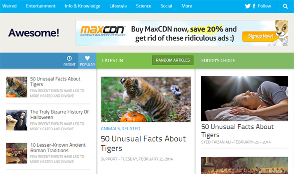
3. Awesome Mag with Mega Menu

Awesome mag can be a perfect example of a three column blogger template available online for free with non-removable credit links of templateism. Not only homepage but also post pages are divided into three partitions. Left is a little smaller than right sidebar while middle post wrapper width is quiet satisfactory.
download awesome mag free

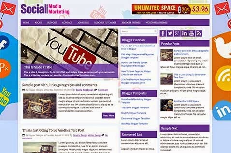
4. Social Media Marketing on Deluxetemplates

A perfect choice it is for SMM bloggers who are buzzing about social media marketing. This template can be used for many purpose.
SMM template for free

5. Dynamo Mashable Copy Blogger Template

Dynamo is a standardized blogger template looking similar to mashable online magazine. That will be a perfect match for a adsense tech blogger as this is ads ready as well.
Dynamo 3 column layout by SEOBloggertemplates

6. Corner mag by freebloggertemplates.net

A compact ads ready, magazine styled and SEO optimized three column blogger template is available on freebloggertemplate.net. You can easily download this template for free with credit links from THemespaper. The template is responsive as well which improve appearance.
corner mag new blog template

Final Words

To stay updated with my blog click here to subscribe to the RSS feed and get all new posts in your inbox. If i can have your thoughts on this post!

Friday, 8 May 2015

Making Your Blogger Template Responsive

I get many question as a UX developer about the template design of blogger. Some are very serious like, "How do i make my blogger template responsive?". Why they should not pay more weight to a responsive layout. mobilegeddon is about to launch which will take the mobile friendliness as a ranking signal and it becomes necessary to make your website and blogs mobile friendly.


What does Responsiveness mean?

top 10 richest person in Kanpur

Responsiveness is the liquidity in a website design and a tendency to transform width height and wrappers according to the size of browser window or device screen. The responsiveness has become the life blood of website design now a days. Your coding ought to be very neat and clean for the purpose of getting fitted for every device. I've launched a new Blogger template that can tackle all your problems for $10 at lifetime. But I know some of you are not that wealthy to pay for a blogger template and reading this post just because you want your blogger template to be responsive.

Your audience having problems when they surf your blog is not a good signal for your website repo and Search Engine OPtimization efforts as well. The ranking signal is also broken which hard your site visibility on Search Engine Results page. 

I guess, you're thinking ,"Hey! I am not a UX developer. How would i do it? Nah! This is beyond my skills."

Trust me, you will need no extra skills but some beginner knowledge of CSS and layout optimization.

Things you need to make your template responsive

CSS

Before starting it out, You'll need to know basics of CSS and then you're ready to do it. CSS is as easy as literature of Primary classes. You'll be saying, "Hey! Tell me how?" W3schools can better teach you some basics of CSS.

Blogger Knowledge

Unless you're not familiar with blogger template HTML, I ask you to stay away. This is not the work of dollish folks. You need to have a simple knowledge of DIV and wrappers which are used in your template.

How to make responsive blogger template?

There are many resources to study about responsive web designing. COde school and w3school is best. You need to become an expert of Bootstrap to make a fully responsive blogger template. Many of folks are still unable to design a responsive blogger template even if they are an expert of Bootstrap just because of complexity in blogger XHTML language. 

We will use META and MEDIA tags to liquidate 

Adding DEVICE WIDTH meta tag for responsiveness

As usually we do it in any case of template customization, Goto Template setting and refer to EDIT HTML there.

Now just above /head paste the code below

<meta name="viewport" content="width=device-width, initial-scale=1, maximum-scale=1"/>

Working with @media tags 

Once you've inserted basics of CSS and HTML in your brain, you will have no issue in making your template responsive.


Let me tell you How.


@media screen and (max-width : 1280px) {
/* CSS FOR NETBOOK AND DESKTOP ------------*/
}
@media screen and (max-width : 1024px) {
/* CSS FOR TABLETS ------------*/
}
@media screen and (max-width : 768px) {
/* CSS FOR SMALL TABLETS ------------*/
}
@media screen and (max-width : 640px) {
/* CSS FOR IPHONE ------------*/
}
@media screen and (max-width : 480px) {
/* CSS FOR MOBILES ------------*/
}
@media screen and (max-width : 320px) {
/* CSS FOR SMALL OLD MOBILES ------------*/
}

Media queries are separate CSS for each device size. For Tablets, you need to write your CSS code for each wrapper separately.  You have to be very very careful while writing CSS code for each media screen. Consider the maximum width of the media screen in your mind and keep writing it.


I have an example of it.


In the below snippet I have a main content wrapper to be liquidated. Let's see how I do it.


@media screen and (max-width : 1280px) {
/* CSS FOR NETBOOK AND DESKTOP ------------*/
"main-wrapper {width:1000px; height:auto; padding:5px; }
}
@media screen and (max-width : 1024px) {
/* CSS FOR TABLETS ------------*/
"main-wrapper {width:800px; height:auto; padding:5px; }
}
@media screen and (max-width : 768px) {
/* CSS FOR SMALL TABLETS ------------*/
"main-wrapper {width:490px; height:auto; padding:5px; }
}
@media screen and (max-width : 640px) {
/* CSS FOR IPHONE ------------*/
"main-wrapper {width:400px; height:auto; padding:5px; }
}
@media screen and (max-width : 480px) {
/* CSS FOR MOBILES ------------*/
"main-wrapper {width:350px; height:auto; padding:5px; }
}
@media screen and (max-width : 320px) {
/* CSS FOR SMALL OLD MOBILES ------------*/
"main-wrapper {width:1000px; height:auto; padding:5px; }
} 

In the above example, I've allotted many width to a single HTML object to be shown on different screen sizes.

What to Keep in Mind?

#Tip1
Make sure you've alloted a wrapper with div to each object of the blog. Keep in mind, you're going to allot different widths to a single object in many cases, be cautious.
#Tip2
Its the work of great confusion of mind. You need to make a framework how your blog should look like on every device. This will make you committed about the widths and paddings.
#Tip3
Don't waste you time if unable to customize and optimize your template. Upload a free responsive blogger template and enjoy the juice of responsiveness. Don't commit the stupid act of buying premium unless you have sufficient to spend.

Final Words :

In the flowing Ganga, you shall also leverage the juice of responsive blogging. In lack of responsive web design many webmasters have already faced many problems. It is better to make your layout responsive that to repent afterwards.
Sunday, 3 May 2015

20+ Sexy SEO Optimized Blogger Templates


That has been the passion of every blogger to make his blog look stylish and different along with the optimization as to SEO guideliness by Google webmasters. Now I've gathered a few free SEO blogger templates to Download for free and enjoy blogging with a peace of mind. Blogger templates I've gathered are easy to install and sexy enough to attract your audience.


Real Mag Responsive Magazine Template

A blogger template with fascinating layout to addict you to blogging.

Arcade Mag 

The Ultimate gaming Bloggers template full of interesting features with login/register.
As clear it is with the name, This is just awesome. So far as I see, the design is perfect like mashable.

Best Magazine Templae BY SBT

A magazine template made for blogger platform with perfection in Search ENgine optimization to leverage the power of blogging at blogger.

Beta Commerce | Blogger Ecommerce Store Template

Who said, "Blogspot platform can not develop a Ecommerce shopping website." The proof is here.

Buzz Mag Latest Release by Templateism

A seductive Dark backgrounded fascinating looking template is from template which is designed tremendously by Syed Faizan Ali.

Couponism Coupon and daily Deals WEbsite template

For bloggers who are passionate about buzzing about latest coupons and deals on different marketplaces, this template is like a boon.

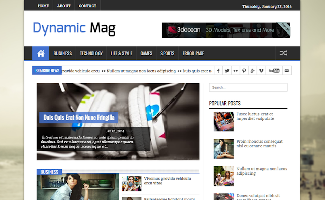
Dynamic Mag

A very popular 100% SEO done template known as Dynamic Mag for Big blogspot blogs.

Fast Mag By MBL

Another magazine template with a feature post slider and posts in attractive view for user engagement.

Geekeism Premium Template

A 100% SEO optimized and best fit for a adsense blog template. Template designed to monetize with ads smartly.

ModernMag Theme

A design that will turn your blog into a magazine like timesofindia or indiatimes. The color scheme is mind blowing.

Moviesm for Movie Review Blogs

The layout developed specially for movie reviews blog and this fit perfect on a movie review of videos blog.

News Pro

Simplified news blog that can generate organic views through Google just with a quallity content. Just because of the SEO factors, theme is kept simple.

Personal Mag WordPress Adapted Template

Template is made seeing the standards of WordPress blogging platform. The Fixed header image which does not move and the sticky header which stick to the top when scrolling down to the blog looks nicy.

Redesign Simple

The Appearance is quiet simple but the quality of the Design is premium. SEO score is also 4.5 starts out of 5 full.

Divinity

A sleek template for them who love simplicity and clean background. Cluster less blogging template.

SEO mag 100% optimized

Turn your blog into a optimized magazine that possess all the features of a perfectly optimized blog.


Soonex Time Machine Coming soon

A theme you'll need to place on  a blog which is in prelaunch now.

Techism Tech Blogging Template

A techno freaker theme which enhance the appearance of a software informaer or a gadget review blog.

Torrenteism For Nulled Bloggers

To make a beatutiful blog like kickass.to you'll need this theme. This template has just copied the overall color scheme of kickass.to website which is a popular torrent website.

Saturday, 2 May 2015

Add Professional 404 Error Page in Blogger


 Professional 404 Error Page in Blogger

There is no good impact of visualizing a badly designed and poorly written 4o4 error page of your blog. Let's start the discussion. In the ancient Blogger user interface there was no right in the hands of a blogger to edit the 404 error page but in the new interface it's possible because now this feature has a lot of weight because of SEO and hence is taken into search preference section.


What is 404 Error Page ?

It is a HTML web page which is in prevalence to show the error when a user fault fully opens a broken or not found location. In other words, when you enter an incorrect URL which is a suffixed to your blog URL then that page appears.

Professional Error Page

You can have a professional looking 404 error page on your blogger blog very easily.

Features

Advantages of this page are listed below.

  • Full Page Width : This page consumes the full width of your blog and hence look professional. 
  • User Friendly Message : It conveys a message that is soothing and relaxing. Your audience is not gonna go rude after landing on a 404 error page. 
  • Go Back Link (JavaScript Link) : The link which was recently visited will be linked with the help of JAVA SCRIPT and your audience will get back to that page as they will click the link. 
  • Report Problem To Us (Link To Contact Page) : making your website professional, this page consists a link to the contact us page to land users to a contact form page where they can contact you. 
  • Go To Homepage (Link) : So this is a common homepage link for better navigation. How to Add ERROR 404 Page

How to Install?

  • Go To Blogger >> Settings >> Search Preferences 
  • In the Crawlers and Errors Section, find Custom 404 Page and Click on "Edit". 
  • Now a box will appear where you have to paste the following code. 


<!-- Yesiamblogger 404 Page -->
<p style='line-height: 30px'><strong>
<font color='#ff0000' size='5'>
Oops!
</font> <font color='#666666'>
Looks like you either clicked a broken link or a page that you were looking for doesn't exist. <br/> Kindly do one of the followings:
</font></strong></p>
<ol style='line-height: 25px'>
<li><a href='javascript:history.go(-1)'>&#171; Go Back</a> </li>
<li>Report the Problem to us by <a href='CONTACT PAGE URL'>Clicking Here</a>&#160;&#160;&#160; (<em>This will help us serve you even better</em>) </li>
<li>Go To Homepage by <a href='HOMEPAGE URL'>Clicking Here</a>
<br/></li>
<li>Search Anything Using Below Search Box</li>
</ol>
<br />
<center><form _lpchecked='1' action='/search' class='search-form' id='search_mini_form' method='get'>
<input id='searchinput' name='q' onblur='if (this.value == &apos;&apos;) {this.value = &apos;Type Here & Hit Enter&apos;;}' onfocus='if (this.value == &apos;Search the site&apos;) {this.value = &apos;&apos;;}' type='text' value='Type Here & Hit Enter'/>
<input id='searchbutton' style='vertical-align: top;' type='submit' value='Search!'/>
</form></center>
<p><br/><br/><br/></p>
<p align='center'><font size='5'>Page Not Found!</font></p>
<br /> <br /> <br />
<p align='center'> <font style='font-size:150px; font-weight:bold;' color='red'> 404 </font></p>
<style>
.status-msg-wrap {
font-size: 100%;
margin: none;
position: static;
width: 100%;
}
.status-msg-border {
display:none
}
.status-msg-body {
padding: none;
position: static;
text-align: inherit;
width: 100%;
z-index: auto;
}
.status-msg-wrap a {
padding: none;
text-decoration: inherit;
}
#sidebar-wrapper, #midsidebar-wrapper, .gapad2, .blog-pager, .post-header-line-1, .post-footer , #rsidebar-wrapper { display:none !important;} #main-wrapper { width:98%!important;} .post { width:98%!important; }
#searchinput {
background: #FFF url(https://blogger.googleusercontent.com/img/b/R29vZ2xl/AVvXsEiMoem2TCvQq9rBefnhtijDCC5pl4R_mK5KZj36Vge4TcBqQG-hZlqhOi5Zp1m7spW8t6YbAE9jqYPYov2RLZ-86q55ToNGqsshhYSIUI1frcvSUeZLy99wRtDC9Gf2_iIx4vS6fjw3FiIh/s0/search.png) no-repeat 7px 8px;
background-color: #FFF;
border: 1px solid #ddd;
color: #A0A0A0;
display: inline-block;
font-family:arial;
font-size: 12px;
font-weight:bold;
height: 24px;
width:300px;
margin: 0;
margin-top: 5px;
padding: 5px 15px 5px 28px;
vertical-align: top;
}
#searchinput:hover{
border: 1px solid #bebebe;
box-shadow: 0 1px 2px rgba(5, 95, 255, .1);
padding: 5px 15px 5px 28px;
}
#searchbutton {
background:#444;
color:#fff;
height:35px;
border-radius:5px 5px 5px 5px;
box-shadow:1px 2px 1px 1px #ABABAB;
border:1px solid #fff;
margin-top:3px;
padding:8px;
}
#searchbutton:hover{background:#555;}
</style>

  • Replace "CONTACT PAGE URL" With Your Contact Page Link 
  • Replace "HOMEPAGE URL" With Your Homepage Link
  • Click "Save Changes" & You Have Done!

How To Check This Page ?

After installing this page, now you must want to see that page that how it looks like in your own blog. In order to check that page, enter any incorrect url of your blog in the address bar and hit enter. Look at the example below
http://www.yourblog.blogspot.com/404
http://www.yourblog.blogspot.com/FO


All Done . Now Enjoy.

Friday, 1 May 2015

Shouter SEO Optimized AdsReady Blogger Template


SEO blogger template
Download Template Live Preview

Shouter SEO 100% SEO optimized blogger template

Shouter seo is a premium blogger template with make your blog look professional. I've tried my best to optimize it for best result. 

There are many reasons why you should design your own blog on this template.

Fitted for every device

Shouter SEO blogger template
The topnotch skill has been executed to get it on a liquid layout so that the website made on this blog will be visible to every device and browser. Content is always in the frame of the browser.

Clean Footer Section

The footer section has been kept so stylish and professional that the blog will also look very elegant and premium on this template.
footer seo template
Footer Shouter SEO template

More Features


  • Current Version : 1.1.0 - This is a beta version and you'll get regular updates about the version upgrade.
  • 100% Responsive Liquid Layout - Liquidity is the need of the hour. So let's go liquid and responsive.
  • Ads Ready - Now Monetize your beautiful blog with adsense or any other revenue sharing program easily.
  • 100% SEO Ready - No need to pay more head to the quality of SEO on the HTML. Everything is just perfect.
  • Threaded comments - Perfect for long discussions on the posts. Nice visualization of sole and replied comments.
  • 3 Column Homepage and Two Column right sidebar Archive page - Variationas are given to the layout accordingly.
  • Four Column Footer - Responsive footer to make it look rich and healthy blog. Tell more about the blog and in user trust.
  • Stylish Search Box with more options - Now change the style of search box according to the type of your blog or your own mind..
  • Awesome Hover effect on Popular posts image - Now surprise your audience with your animations on the website.

More Screenshots

responsive blogger template
mobile blogger template 
Preview Blogger template SHouter SEO

Wednesday, 29 April 2015

6 Places to Sell Your Website and Templates

If you're a freelancer designer, you will be finding some online digital shops to sell your precious web-designing work at reasonable prices. Your own website however is not quiet sufficient to reach the potential you actually deserve. Place to sell your templates and other digital stuff are many and you can go popular with it as well.

How to sell my templates


Envato market however eat the maximum part of the digital market share but there are many other places to sell your stuff.


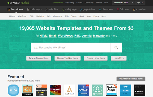
1. ThemeForest

Themeforest has been the biggest marketplace for digital designing stuff like vectors, graphics, themes, templates, layouts and much more. Once your work went popular and it can be rewarded with feathers to bird here.
Theme forest however has strict ruled regarding becoming seller on it and getting your stuff listed. But with a hard work, you can find success in getting your things listed there.
Once you understood the overall process of getting it done, no one can snatch success from your hands.

2. Templamatic

Another marketplace to sell templates and web layouts and design is known as TemplaMatic where you can easily get your product listed. Easily listed means your work needs quality and uniqueness necessarily. Criteria to get your themes listed here are quiet less than that of ThemeForest and hence you can get features here by complying with those rules.

3. Flippa

Here comes the biggest marketplace to sell websites, domains and applications. Flippa is a huge place where business owners seek domains on sale and website of their interest. Getting your website or domain listed is not free here. It costs $30 to be seen on the list.
Earning opportunities are many.

4. BuyStockDesign

A Digital design marketplace identical to Themeforest has a good audience employed in buying and selling their virtuous digital designing work online either site templates or images(graphics).
There is huge collection of WordPress Themes, Joomla Themes, and HTML templates. CMS designs is the trend on BUYSTOCKDESIGN.

5. eBay

Ebay has been the biggest online shopping ecommerce store for more than a couple of years and many sellers are engaged with this biggest on-line shopping website ranking after Amazon. E bay has a digital product category where your templates can easily be listed and sold for a considerable amount.

6. Your Own Website

Regardless of the nature of your website, your website has the ability to sell your digital stuff online. Whatsoever, a large potential can not be expected but the probabilities exist to get your stuff liked and sold on your own website.


Hope above information interested you a bit.